 Above: the chef, who first came to life quite a few years ago now, reworked for the submission first mentioned below. I am not as happy with him as I am with the babushkas and the seaside children, but I think that if I keep going with him I will just get sick of the whole thing and will end up submitting nothing (I need to submit three at once, he is the last one I need to finish).
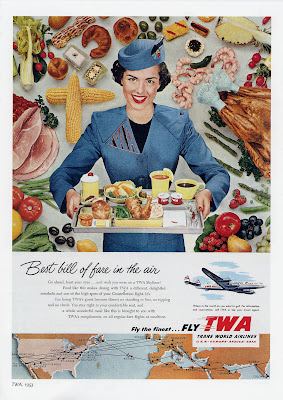 Above: a beautiful 1950's TWA advertisement which I used as inspiration for the chef's colour palette. I love the mixture of bright and pastel colours, it's very 1950's and pleasingly odd to contemporary eyes. And the topic: aeroplane food (supposedly!) is one of my nearest and dearest. The uniform is also rather elaborate and looks technically impossible, except to a Paris couturier. I stumbled across this picture at work: I believe an ex colleague with no respect for the sanctity of books tore it out of a Taschen vintage advertising compendium.
 January 9: I only just submitted the three illustrations today, after too many trials and tribulations for my liking: the test (which I sat twice due to a technical hitch), their server problems over Christmas, as well as (probably related but unacknowledged) changes in the format, including a now compulsory zip compression requirement for which I had to buy Winzip. I wish I could also download some patience...
 Above: I am unusually proud of 'Doll Face', a design which I based on the babushka and painted up a few months ago at work. I scanned her into Photoshop, cleaned and re-coloured her in our palette for that month's range, then sent the artwork to China. There it was printed onto white cotton poplin, then turned under and neatly and sewn onto the t-shirts by hand. The hair was also made of two pieces of navy blue fabric, again sewn by hand. I hope that the people doing the sewing got some enjoyment out of it.


