skip to main |
skip to sidebar
 Above: As I write, a film is being made in my very suburb about an artist who obsessively makes self-portraits in an attempt to understand himself. (Not a bad method, I think.) Because it is a film, other people were asked to actually provide drawings of the actor who is playing the character (thespians are too busy to draw themselves, and anyway, I think the director required alot of portraits to cover the studio set). So yesterday I was e-mailed a series of photos of this pretty, self-conscious young man with wavy black hair, a bushy beard (what is it with beards? They are so, like, now!), bright blue eyes, pale skin, a round pink mouth and big pink ears. I had 40 minutes to do both of my drawings, I wish I had had longer: I would love to have been able to concentrate on those three colours that I saw (black, blue and pink) and really simplify his features against them.
 Above: this is my second attempt, using my medium of choice, which was black ink. I loved the curls in his hair and I wanted to show their blackness against the pale skin. And even though the blue eyes don't look quite right as there is too much black around them, I'm pleased that I coloured his little mouth brightly. And his ears. An homage to the pretty male subjects of Elizabeth Peyton, as promised a few posts ago (Book Review, December 28, 2007).
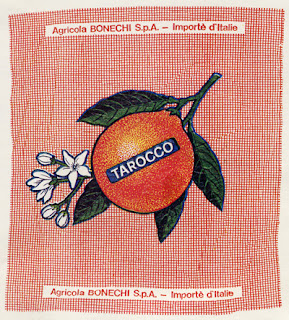
Above: one of the many lovely habits that the Italians have is that they like to wrap fruit in printed paper. (In retrospect, it is probably environmentally speaking not such a great habit.) Anyway, it looks incredibly pretty, advertises the good work of the farmer and has probably kept alot of artists employed. I'd love to say that this wrapper is from an orange that I ate in Rome in the summer of 1998, or something, but it is actually a notecard published as part of a series by the ever clever Chronicle Books and bought from Readings in Carlton.
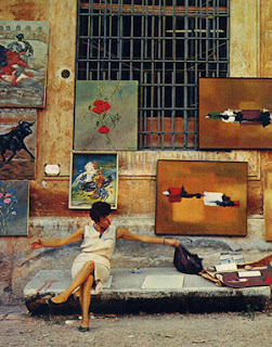 Above: Cool chick of Rome, from Southern Italy, by Mattieu Smedts (The Hague, 1966). Photograph by Kees Scherer. A fantastic book of 1960's technicolour photos, so great that I could almost reproduce the whole thing here. A find from Booktalk, Swan Street, Richmond.
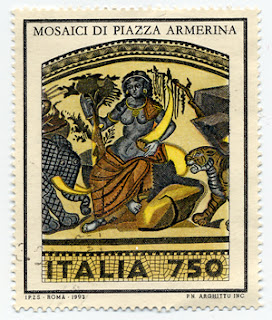 Above: a stamp on a letter that I would have received in the early 1990's, probably from The Florentine Cousin. How could you not love a country that produces such pretty stamps??!!
 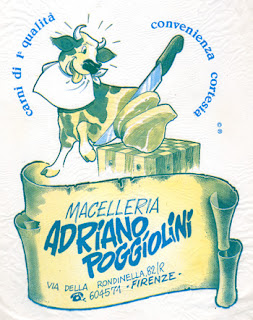 Above: again, credit to The Florentine Cousin, for finding and sending me this butcher shop's bag. In case you have pondered what might happen to a printed plastic shopping bag after it has sat under glass in a picture frame for approximately fifteen years: the red colour has all but disappeared, rendering those previously irresistible steaks almost unpalatable.
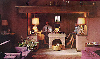
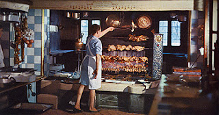 Above: images from The Cooking of Italy, Time Life Books, New York, 1969. Because these photographs sit on opposite pages in the book, I like to imagine that the people sitting in the little nook above are waiting as the lady below them bastes their main course. However, the first picture above was taken in a home (yes a h o m e) on an island near Venice, and the picture below it was taken in a country restaurant near Treviso. I'd be happy to dine at either. Photographs by Fred Lyon.
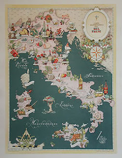 Above: a reproduction found on the internet of my beloved 1946 Carta Gastronomica by Vsevolod Niculin, which lives in my kitchen and was purchased from The Chapel Street Bazaar many years ago. Mine has faded to a nicer shade of green. If you look across the sea to the Croatian coast, the 'south' pointer sits handily above Brac, the island that my parents come from.
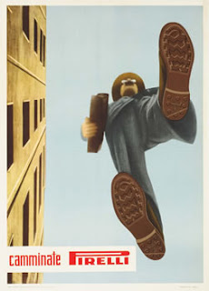 Above: I love vintage Italian (and French) posters. I searched the internet for an example of a travel or food related one to reproduce here. This one caught my eye instead. It translates -- I believe -- to 'Walk in Pirelli'. I think it's beautiful: simple and clever. (Unknown artist, 1950. Image taken from International Poster.)
 Above: As I write, a film is being made in my very suburb about an artist who obsessively makes self-portraits in an attempt to understand himself. (Not a bad method, I think.) Because it is a film, other people were asked to actually provide drawings of the actor who is playing the character (thespians are too busy to draw themselves, and anyway, I think the director required alot of portraits to cover the studio set). So yesterday I was e-mailed a series of photos of this pretty, self-conscious young man with wavy black hair, a bushy beard (what is it with beards? They are so, like, now!), bright blue eyes, pale skin, a round pink mouth and big pink ears. I had 40 minutes to do both of my drawings, I wish I had had longer: I would love to have been able to concentrate on those three colours that I saw (black, blue and pink) and really simplify his features against them.
 Above: this is my second attempt, using my medium of choice, which was black ink. I loved the curls in his hair and I wanted to show their blackness against the pale skin. And even though the blue eyes don't look quite right as there is too much black around them, I'm pleased that I coloured his little mouth brightly. And his ears. An homage to the pretty male subjects of Elizabeth Peyton, as promised a few posts ago (Book Review, December 28, 2007).


